Find the trust gap
Start with the first-screen message, proof, mobile path and CTA friction that shape whether a visitor keeps reading.
Small business websites
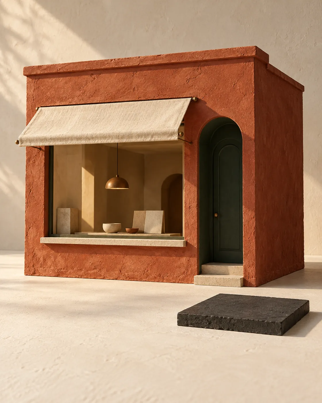
Your website should make a stranger feel safe enough to take the next step. For many small businesses, the problem is not effort; it is unclear messaging, thin proof, slow pages, or a contact path that asks too much too soon. Hearth Web Studio builds calm, focused websites that explain what you do, who you help, why you can be trusted, and what happens after someone enquires. The goal is not a louder website. It is a clearer one: a site that earns confidence before the first call, so better-fit visitors can become real conversations without needing to be pushed.
How Hearth helps
Start with the first-screen message, proof, mobile path and CTA friction that shape whether a visitor keeps reading.
Shape the page around what a cautious buyer needs to understand before they enquire, not around generic sections.
Use calm design, useful copy and visible reassurance so the audit, enquiry or call feels like a sensible next move.
Good visual design matters, but a small business website cannot survive on polish alone. Visitors arrive with quiet questions: is this business legitimate, can they solve my problem, do they understand people like me, and what will happen if I reach out? If the page only looks attractive without answering those questions, the design may be pleasant but still underperform.
Hearth approaches web design for small businesses by starting with trust. That means shaping the page around the real decision a visitor is making, not around decorative sections or generic claims. Headlines need to be specific. Service descriptions need to be understandable. Proof should appear near the moments where hesitation naturally happens. The next step should feel reasonable, not like a leap into a sales process.
This is especially important for founder-led and service-based businesses, where the website often acts as the first conversation. A visitor may not be ready to book immediately, but they should leave with a clearer sense of your value, process, fit, and standards. When the site does that well, conversion becomes less forced. The enquiry is not created by pressure; it is earned by clarity.
Many small business websites have the raw material they need, but it is arranged in a way that makes visitors work too hard. The offer might be split across several pages. Testimonials might be buried near the footer. The contact button might be visible, but the page has not yet given the visitor enough reason to click it. The result is a site that feels complete internally, while still feeling vague to a new buyer.
A clearer structure usually starts with the visitor's situation. What problem brought them here? What kind of help are they comparing? What risk are they trying to avoid? From there, the page can guide them through the offer, proof, process, fit, objections, and next step in a calm order. This does not mean every website needs to be long. It means each section should have a job.
For Hearth Web Studio, a small business website is built like a guided conversation. The homepage should quickly explain the business, show enough evidence to reduce doubt, and make the enquiry path feel simple. Supporting pages can then deepen trust: services, about, FAQs, case studies, resources, or audits. When the structure is doing its job, visitors do not have to piece the story together. They can understand the business quickly and decide whether it is worth starting a conversation.
Hearth Web Studio builds websites for small businesses that need clarity, credibility, and practical enquiry flow. The work usually begins by reviewing the current homepage or planning the first version of a new site. From there, we identify where trust is being lost: vague positioning, weak proof, missing service details, confusing navigation, mobile friction, slow loading, or calls to action that arrive before the visitor is ready.
The design process then turns those findings into a focused site structure and page experience. Copy is written to sound human and specific. Layouts are kept calm and readable. Calls to action are placed where they feel natural. Proof is treated as part of the argument, not as decoration. Technical basics such as responsive layout, metadata, performance awareness, and search-friendly page structure are handled as part of the build, because a trustworthy site should also be easy for people and search engines to understand.
This is not about making a small business look larger than it is. It is about making the business easier to trust. A good website should help visitors feel oriented before they enquire and help the owner enter better conversations with people who already understand the basics. That is the quiet advantage of clear web design: fewer confused visitors, more confident enquiries, and a site that supports the business every day.
FAQ
Small business web design has to build trust quickly with limited attention, limited proof, and often a smaller budget. The site needs clear positioning, useful service detail, visible reassurance, and a simple next step.
Not every business needs a full rebuild. If the foundation is sound, targeted fixes to copy, structure, mobile layout, proof, and calls to action may be enough. A homepage audit is a practical first step.
Yes, but not in a pushy way. Hearth focuses on trust before conversion, so the page earns confidence first and then makes the enquiry path clear, low-friction, and easy to understand.
Helpful starting materials include your services, ideal clients, current website link, testimonials, examples you like, common customer questions, service area, and any photos or brand assets you already have.
Start small
Send your homepage for a personalised 5–8 minute video review and three written priorities, usually delivered within one business day. No sales call is required.